

- Client
- Zuri
- Sector
- Skincare
- Territory
- India
- Disciplines
- Brand IdentityPackaging DesignProduct BrandingSocial Media Design
The brief
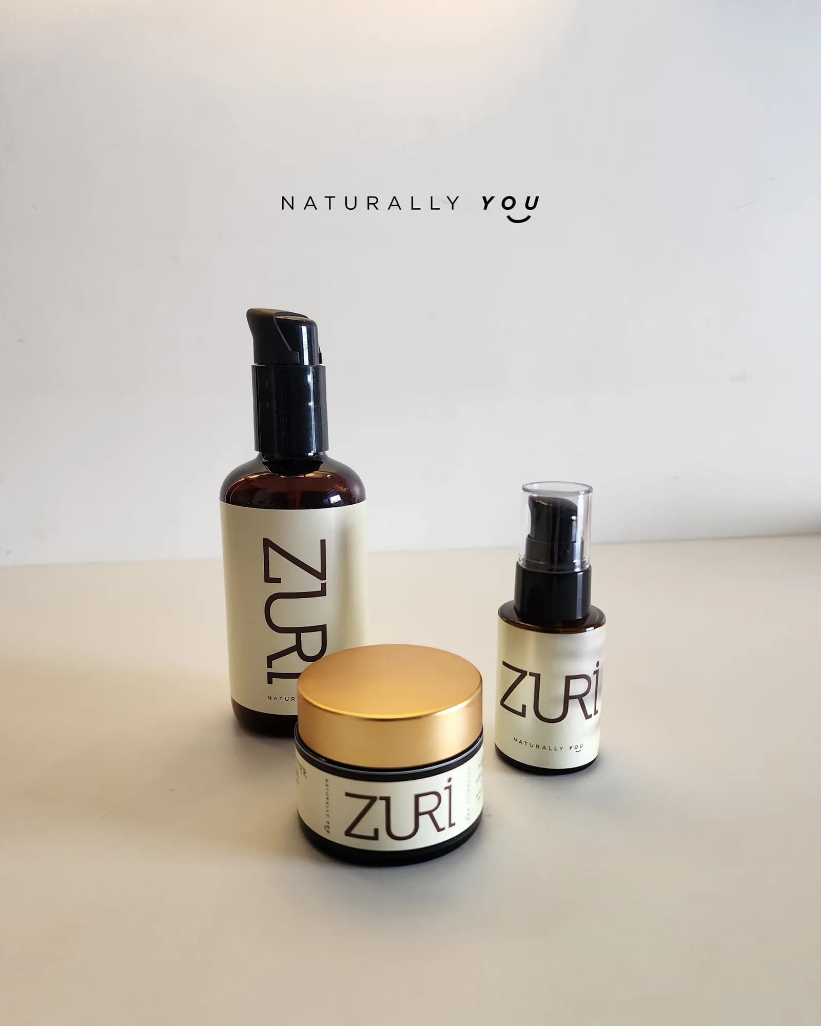
Natural skincare has a shelf full of look-alikes — cream stock, thin serif, a leaf. The brief was warmth without the cliché, and a label system that stays legible at the size a bottle actually is.
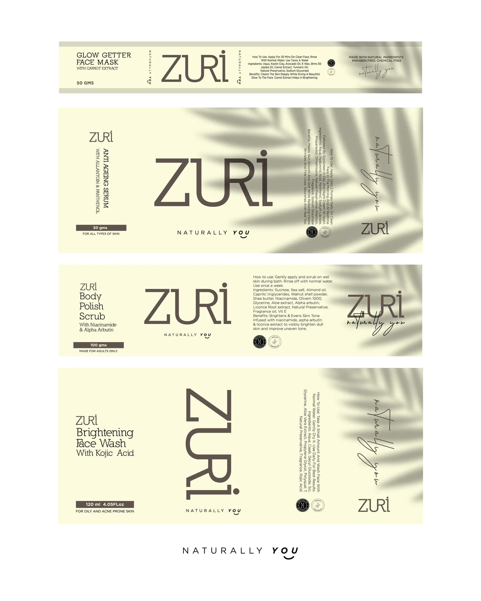
A wide-set wordmark, a single cream ground carried across the range, and a label grid that keeps ingredients and instructions readable while the name does the work from across the room.
Scope
- Brand positioning & tone of voice
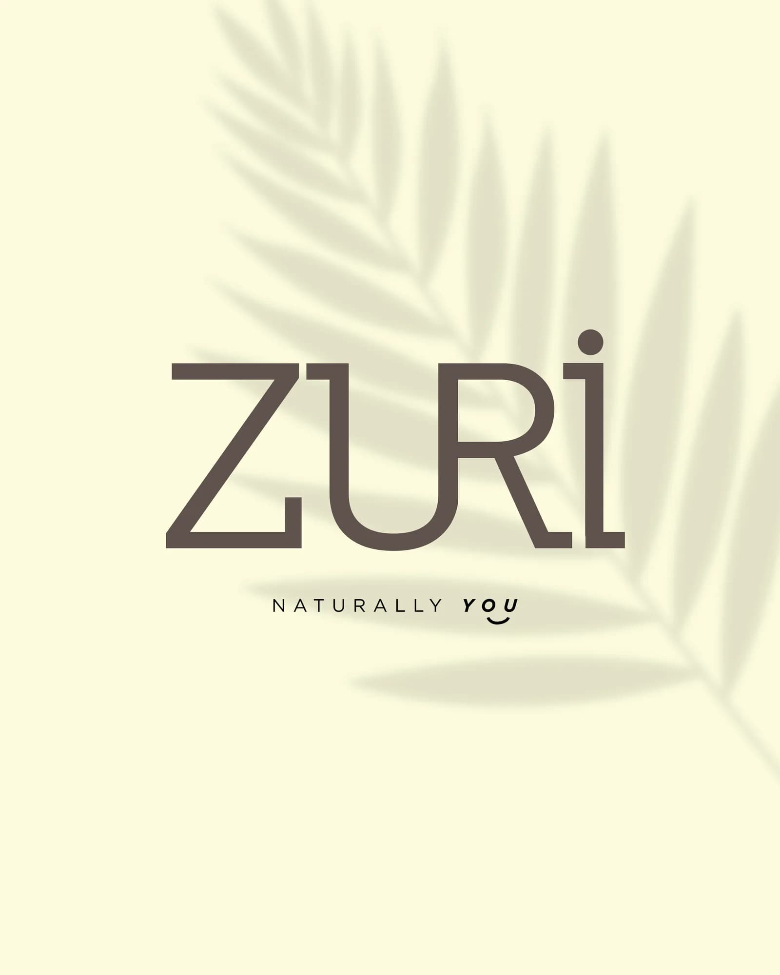
- Logotype and signature
- Packaging and label system
- Product art direction
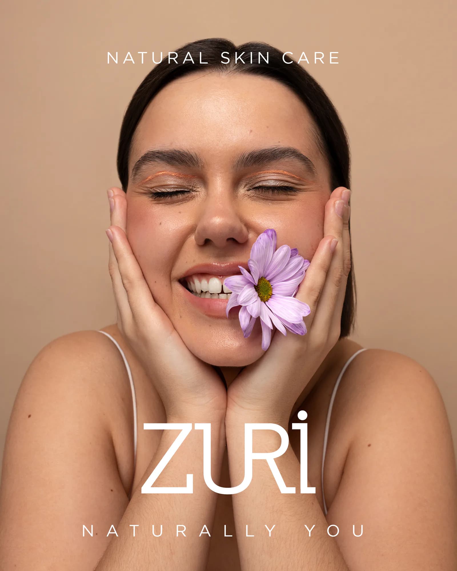
- Launch campaign
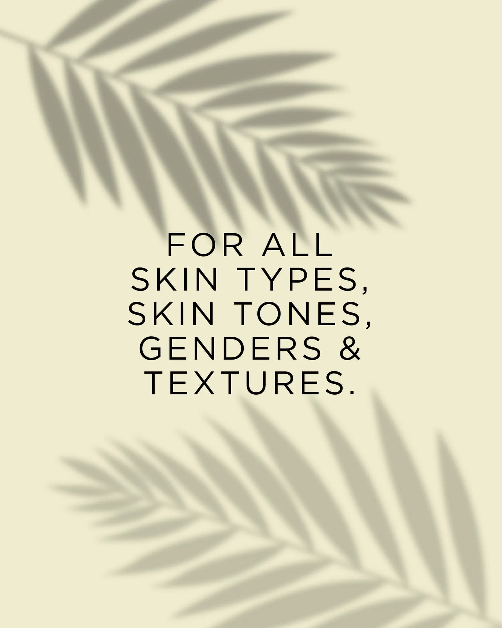
- Social media system
Your brand next
Let’s build yours.